In the digital world, an Ecommerce website design is a game-changer. As folks shift to online shopping, a good Ecommerce site is the key to success. It's not just an online store; it's a hub connecting people and products. This virtual storefront goes beyond transactions, opening doors to smoother user experiences and convenience.
The magic of an Ecommerce website lies in its global reach. It breaks down borders, offering users a world of choices. With online shopping booming, users want a site that's easy to use and makes transactions a breeze. The site's design and features directly impact satisfaction, influencing whether users stick around and buy.
But wait, there's more.
An Ecommerce website is a marketing powerhouse. It's where businesses flaunt their stuff, connect with their audience, and build brand love. The site isn't just a place to buy; it's a reflection of the brand, shaping how users see and trust the business. An Ecommerce website is more than a shopping tool; it's the whole user experience.
A well-made site not only meets shopping needs but also boosts the overall online journey, creating lasting bonds between businesses and customers. As the digital world evolves, How to design an e-commerce website design becomes a big question for many people who want to improve their ecommerce website, defining the future of online shopping. Let's dive into this guide with Canhcam.
What is Ecommerce Website Design?
Ecommerce Website Design is the creation and organization of websites tailored for online businesses selling products or services. Its significance lies in attracting visitors, ensuring a positive user experience, and converting them into customers.
Similar to a traditional retail store, ecommerce websites serve as platforms for buying and selling between consumers and businesses, but the distinction is that all transactions happen online, eliminating the need for a physical location.
Need to Design Ecommerce Website? Visit Our Service: Ecommerce Website Design Melbourne
Types of e-commerce sites you should know
When it comes to ecommerce websites, understanding various e-commerce site types is crucial. Here's a quick overview:
Ecommerce sites are diverse, catering to different business models and customer needs. The main types include:
| Main types | Meaning of each type. |
| Business-to-Consumer (B2C) | Businesses sell directly to consumers on platforms like Amazon or Zappos. |
| Business-to-Business (B2B) | Transactions happen between businesses, such as wholesale suppliers selling to retailers. |
| Consumer-to-Consumer (C2C) | Individuals sell to other consumers through online marketplaces like eBay. |
| Consumer-to-Business (C2B) | Individuals sell products or services to businesses, as seen on platforms like Upwork. |
| Business-to-Administration (B2A) | Businesses provide products or services to government bodies, as seen in e-commerce platforms serving government agencies. |
| Consumer-to-Administration (C2A) | Individuals sell to government bodies, such as citizens paying taxes online. |
| Mobile Commerce (M-Commerce) | Transactions occur using mobile devices, like shopping through mobile apps. |
| Social Commerce | E-commerce transactions take place directly on social media platforms, like selling on Facebook or Instagram. |
| Voice Commerce (V-Commerce) | Transactions are conducted through voice-activated devices, such as ordering through smart speakers like Amazon Echo. |
| Niche E-commerce | Specialized online stores focus on specific markets or product categories, like those offering handmade crafts. |
Each type serves distinct purposes, whether it's direct sales to consumers or facilitating transactions between businesses. Understanding these variations is fundamental for effective Ecommerce Website Design.
Designing an Ecommerce website: Step-by-step
Here is a guide to designing your website design:
Define Your Goals and Target Audience
Define your goals and target audience clearly when planning your website. The primary aim is to facilitate seamless shopping for customers, optimizing the user experience for increased sales. Prioritize simplicity in design to avoid confusing your audience; a straightforward interface is key.
Ensure coherence between your design and the products you offer to engage the right audience effectively. Clearly outline your e-commerce website's goals, be it boosting sales, building brand awareness, or expanding customer reach. Tailor the design to cater to the preferences and needs of your identified target audience for optimal results.
User Engagement
- To maximize user engagement on your website, focus on simplicity, coherence, trustworthiness, and transparency.
- Ensure an intuitive and easy-to-use design, eliminating confusion for first-time visitors.
- Maintain coherence with your product offerings, aligning colours, images, and fonts.
- Instill trust through a professional-looking design that erases doubts during checkout.
- Transparency is crucial; make contact info and policies easily accessible.
- With the mobile-centric trend, prioritize a responsive website for better SEO and customer acquisition.
- Implement clear navigation, high-quality imagery, and a user-friendly search function.
- Utilize personalized recommendations, interactive product pages, and a smooth checkout process.
- Ensure a responsive design, display social proof, incorporate gamification, and provide live chat support.
- Optimize loading speed and leverage newsletters, notifications, and social media integration to enhance user experience and foster engagement.
Optimizing your ecommerce sites
Here is a standard structure for an online store:
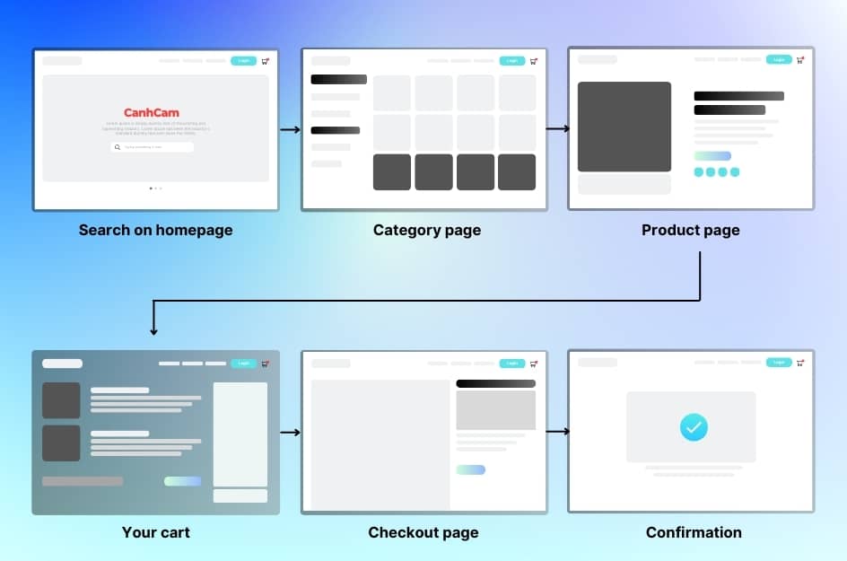
In each step above, you will bring your customers closer to the conversion goal. You should aim to minimize psychological barriers between each of these steps as much as possible. Below are methods for designing a comprehensive website:
Design Tips for the Entire Site
Continuing the above part, crafting a standout website involves a creative and brand-aligned approach. Prioritize user-friendly navigation and instil trust in potential customers.
Diversify your design strategies to enhance overall site quality, focusing on user experience and credibility for success.
An Intuitive Navigation
For a seamless shopping experience, nail your e-commerce website with intuitive navigation. It's all about quick product discovery and easy access to main information.
Optimize menus using clear drop-downs and categorize products with general terms.
If your site boasts an extensive product range, ensure a prominent search bar on every page, helping users swiftly locate what they need.
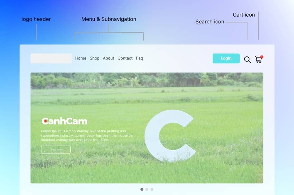
Don't overlook the cart icon – make it visible site-wide, displaying item count. Enhance user convenience by enabling a hover-preview for the cart icon.
Simplify the journey to checkout and consider repeating your call-to-action on various pages, especially for single-product websites.
Elevate your website for a user-friendly, efficient shopping adventure.
Building Trust
Boost user trust by strategically incorporating trusted logos of big brand names associated with your business, signalling credibility and prestige. Display customer testimonials throughout your website, preferably in the footer, to provide social proof and build confidence in your services.
Ensure essential business information, including clear contact details, is easily accessible in the footer of every page, addressing users' primary concerns. Link to important sections such as "About Us," establishing a human connection, and include key policies like privacy, returns, and delivery for transparent communication.
Homepage Design
Your homepage is like a blind date's first moments – a chance to impress, so seize it wisely. Don't dive into a product frenzy; instead, follow a golden rule: avoid turning your homepage into a product list. Opt for an attention-grabbing title that encapsulates your brand and highlights any promotions.
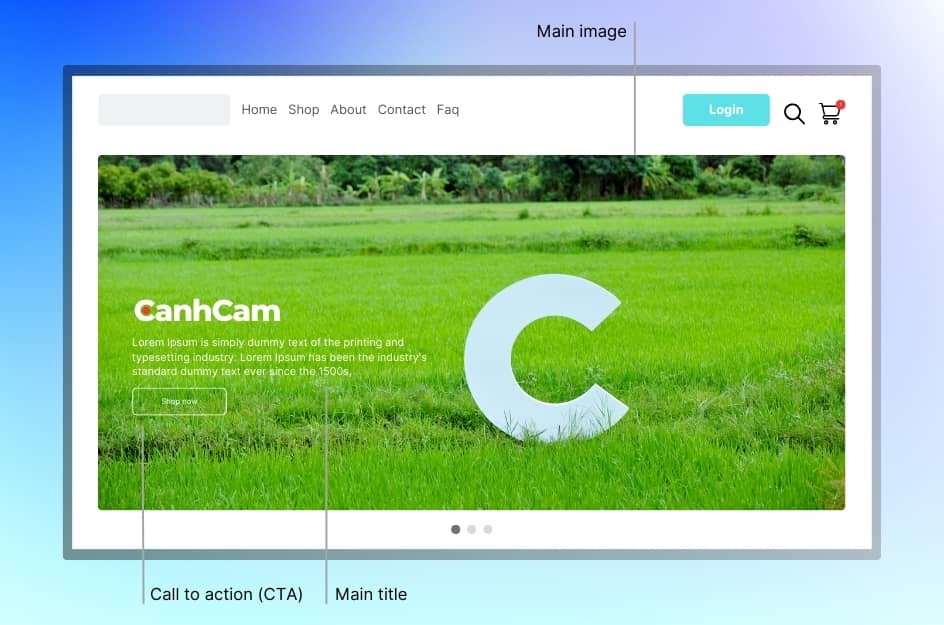
Follow it up with a relevant and distinctive call-to-action (CTA). Incorporate professional, high-quality images showcasing your products in action because, in the online realm, a picture speaks louder than a thousand words. While your homepage isn't a product catalogue, featuring best sellers or products for specific occasions is smart – think of it as your virtual shop window.
Break down your homepage into engaging content sections like featured collections, customer testimonials, or blog highlights. Each section should weave into your brand story, guiding visitors seamlessly through your offerings.
Catalogue Page
Get to your catalogue page easily through the search bar or by selecting a product category. This is where you'll find all the items related to your current needs. If you have only a few products, your listing page will showcase them all.
Design tips for these pages include a clear category introduction to guide customers, enabling filtering and sorting functions for easy navigation, highlighting best sellers and reviews for social proof, and showing stock availability to prevent frustration.
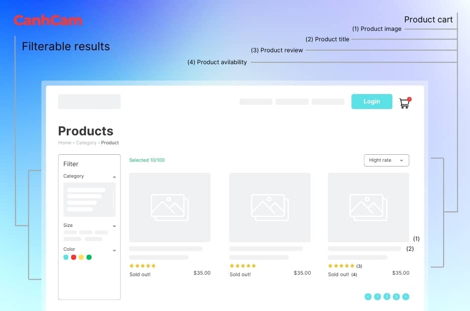
When choosing between grid view and list view, consider the nature of your products – detailed descriptions suit list view, while visually appealing products are better presented in grid view.
Keep it simple, clear, and user-friendly.
Show your Products
To nail the product page design, make it mimic a legitimate shopping experience. Fill it with detailed photos, thorough descriptions, and specs to assure customers they're getting their money's worth. Here are the essential elements of a product page:
“Add to Cart”
Your product page's focal point is the buy button – the cash generator leading to a transaction. Crafting a top-notch buy button is vital. It should be prominently displayed, above the fold, avoiding unnecessary clutter, utilizing whitespace, and having a duplicate at the page's bottom.
Opt for a contrasting colour, ensuring it stands out without clashing with your scheme.
Size matters – make it big enough to catch attention instantly.
Importantly, the button should unmistakably look clickable, adhering to conventional designs. Emphasize its purpose, whether with a shopping cart icon or a clear "add-to-cart" label. In essence, ensure your buy button is impossible to miss, adhering to design principles and user expectations.
Images of Products
To make the digital experience more tangible, use professionally crafted photos from various angles, ensuring every significant feature is visually represented. Don't forget to showcase the product in use for added clarity.
Opt for interactive image displays, like a zoom-enabled photo slideshow, to enhance the user experience. Keep in mind, that bigger images make a significant impact, fulfilling the customer's desire to see what they're purchasing.
Consider incorporating video demonstrations, especially if your product requires a more detailed presentation. Embracing these image strategies ensures a compelling product representation.
Product descriptions
When crafting your product description, aim for comprehensive yet concise information. Provide a brief summary alongside the product and purchase button, with a more detailed description available below or through a "read more" link for deeper insights.
Consider using tabs for products requiring extensive details, such as technical devices or cars. Enhance the user experience by featuring related articles or an "You may also like" section, ensuring the upsell opportunity aligns with the main product.
Incorporate an "add to fav list" button for users with accounts to bookmark items for future reference. Transparency matters—display the estimated delivery time, customer reviews, and testimonials at the page's bottom. Highlight stock availability for clarity and SEO benefits. Streamline your product page for a seamless and informative customer journey.
Shopping Cart & Checkout Design
How to make the cart stand out?
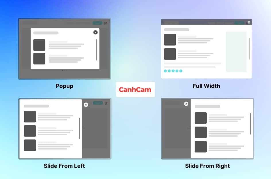
Full page, centred modal, or sliding from the side—pick what suits your case. Ensure it complements the shopping experience. If the cart is empty, don't just state it; prompt users to add items with a call-to-action or shopping tips. For filled carts, display product details clearly: inventory with pictures and short descriptions, quantity, options, individual price, and total price.
Now, mobile optimization is crucial.
Despite mobile sales potentially hitting 52% of e-commerce sales, the alarming 85% mobile cart abandonment rate is a red flag. Optimize your mobile checkout; most cart solutions offer responsive designs. For customizing or starting afresh, consider these mobile UX tips: use a fixed CTA at the top, ensuring it's always visible, and prioritize clear, tap-friendly buttons for seamless navigation. Streamline your mobile checkout—it’s as vital as, if not more than, your desktop experience.
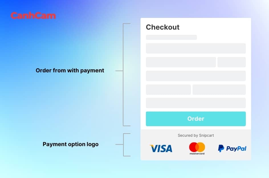
Checkout
Checkout is a pivotal stage in the e-commerce process. Simplify the process by offering a guest checkout option;
Cart Overview:
- Users review items in their carts.
- Clear visibility of product names, quantities, and prices.
- Ability to edit or remove items directly from the cart.
Billing Information (Optional):
- Collect necessary billing details such as name, address, and email.
- Offer the option to use the same information as shipping to streamline the process.
Shipping Details:
- Obtain shipping address and contact information.
- Align shipping details with billing information if they match.
Shipping Method:
- Present shipping options with associated costs.
- Allow users to select the preferred shipping method.
Payment Information:
- Collect payment details securely.
- Display accepted payment methods and security logos.
- Provide a seamless experience for digital wallet payments.
Order Confirmation:
- Allow users to review their orders before finalizing the purchase.
- Display the total cost, including taxes and shipping fees.
- Offer an option to go back and edit information if needed.
For Digital Goods:
- Skip shipping-related steps for digital products.
- Emphasize instant access or download information.
Guest Checkout Option:
- Provide a guest checkout option for users who prefer not to create an account.
- Avoid forcing users to register before completing their purchase.
Minimal Information Request:
- Request only essential information to expedite the process.
- Eliminate unnecessary form fields to reduce friction.
Single-Column Layout for Mobile:
- Opt for a single-column layout for a mobile-friendly design.
- Ensure easy navigation and input on smaller screens.
Visual Streamlining:
- Streamline form fields visually for a clean and organized appearance.
- Use input masks for certain fields (e.g., DD/MM/YYYY) for standardized input.
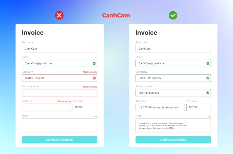
Inline Validation:
- Implement real-time feedback with inline validation.
- Notify users immediately of any errors or required fields.
Post-Purchase Expressions:
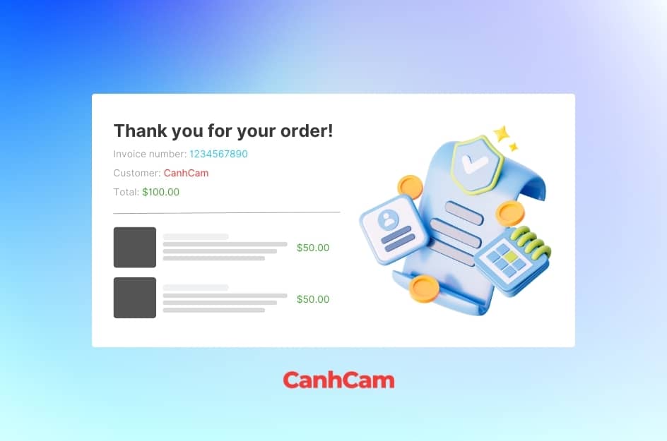
- Express gratitude post-purchase for a positive closing experience.
- Provide clear details on the order confirmation page.
Transparent Payment Options:
- Display all payment options with logos for transparency.
- Ensure users are aware of the available payment methods.
Security Assurance:
- Assure site security through HTTPS encryption.
- Provide detailed explanations about the security measures for curious users.
Benefits of Ecommerce Website Design
Running an e-commerce website has clear benefits.
Firstly, it cuts overhead costs significantly, with no need for physical storefronts, minimizing expenses related to commercial real estate, security, and employee wages. Instead, you pay for web hosting, your domain, and building your site. This cost-effectiveness extends to logistics, as e-commerce allows easy scalability, avoiding the hassle and cost of relocating a physical store.
Another advantage is the ability to reach a broad audience globally, enhancing sales potential. Tracking logistics is streamlined, facilitating efficient sales management.
However, challenges exist.
Security threats, including potential breaches and payment processor issues, require careful management, often involving professional assistance. Intense competition demands diligent promotion and traffic-driving efforts to succeed. IT issues, such as website crashes, pose risks, and solving them may incur additional expenses.
Shipping logistics can be complex, necessitating a seamless solution to avoid financial strain. Lastly, the limited personal connection with customers in the online space can be a drawback. While e-commerce offers numerous advantages, addressing security, competition, IT challenges, shipping logistics, and customer connection is crucial for success.
Why should you choose to design an Ecommerce website with CanhCam?
Choose CanhCam for your Ecommerce website design needs. Our platform goes beyond the ordinary, offering features that set us apart. We assist in crafting digital content strategies with clear goals and a roadmap to success.
With effective content marketing, we help businesses showcase their products and services, giving them a competitive edge. Our sophisticated web management system simplifies order processing and supports marketing campaigns, flash sales, and more.
Through CRM and ERP integration, your website becomes a virtual supermarket. Our highly skilled team brings innovative web design concepts to meet the E-commerce needs of businesses, big or small. CanhCam prioritizes website security, backed by our experienced IT and development team.
We provide comprehensive customer support throughout the design process and beyond. With regular data backups, we ensure the ongoing stability of your website post-launch. Elevate your Ecommerce experience with CanhCam – where innovation meets practicality.
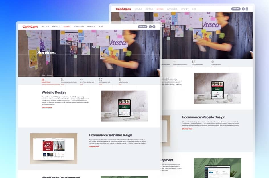
CanhCam - The reputable e-commerce web design agency for your next project.
CanhCam is a reputable e-commerce web design company that can be an excellent choice for your next project. Whether you are a newly established small business or a well-established enterprise, CanhCam has the expertise and experience to create a professional and visually appealing website, helping you stand out in the competitive online market.
Furthermore, CanhCam provides a range of services that go beyond web design. We can also assist in web development, website maintenance, digital marketing, and brand building. This means we can support your business in various aspects of your online presence, ensuring consistency and cohesion across all channels.
CanhCam is a reputable e-commerce web design company that should be considered for your next project. With a highly skilled team of experts, proven track record, commitment to customer service, and a range of comprehensive services, we possess all the qualities necessary to create a successful website. When choosing CanhCam, you can trust that your website will be a powerful tool to help you achieve your online business goals.
Frequently Asked Questions (FAQs)
1. What is the price of a website for e-commerce in Australia?
Domain name, SSL certificate, e-commerce hosting, payment processing integrations, store theme, and all the other third-party tools you are using will have to be tackled to develop an e-commerce website.
These services, products, and building of an e-commerce website an examples of something that may vary based on a provider and your needs, so there is a sort of budget that you cannot use all of the time. As an alternative, consider what is the fair price to invest in the startup or business development phases of your business.
2. Which is the best ecommerce platform?
Famous e-commerce platforms include Shopify, WooCommerce, BigCommerce, Magento, Wix eCommerce, Squarespace Commerce, and Volusion. Shopify is easy to use and adaptable to businesses of any size. WooCommerce is a powerful extension for WordPress. BigCommerce contains the best features for expanding firms. Magento is an open-source and rich-featured option for large businesses. Based on your budget and business needs, select the platform.

