Building a website is like opening a storefront – your homepage is the welcoming entrance. It's crucial to get it right! This guide delves into the core principles of Website Homepage Design, equipping you to craft a homepage that captivates visitors and effectively communicates your brand.
We'll break down key elements like user-friendly layouts, clear navigation, and compelling content strategies. Learn how to showcase your brand identity visually and through your messaging.
By following these steps, you'll create a homepage that not only looks good but also converts visitors into engaged users, boosting your online presence.
Why Is Homepage Website Design Important?
Your website's homepage is like a shop window for your business online. It's the first thing visitors see, and it has a big impact on whether they stay or leave. A well-designed homepage is:
- Visually Appealing: People are drawn to attractive websites. High-quality images and a clean layout make a good first impression.
- Easy to Use: Visitors should be able to find what they're looking for quickly and easily. A clear navigation menu and simple layout are key.
- Informative: The homepage should tell visitors what your business does and why they should care. Use clear, concise language to explain your value proposition.
- Trustworthy: A professional-looking website builds trust with visitors. Make sure your homepage is free of errors and looks polished.
By investing in a good website homepage design, you can create a positive first impression, improve user experience, and ultimately increase your chances of converting visitors into customers.
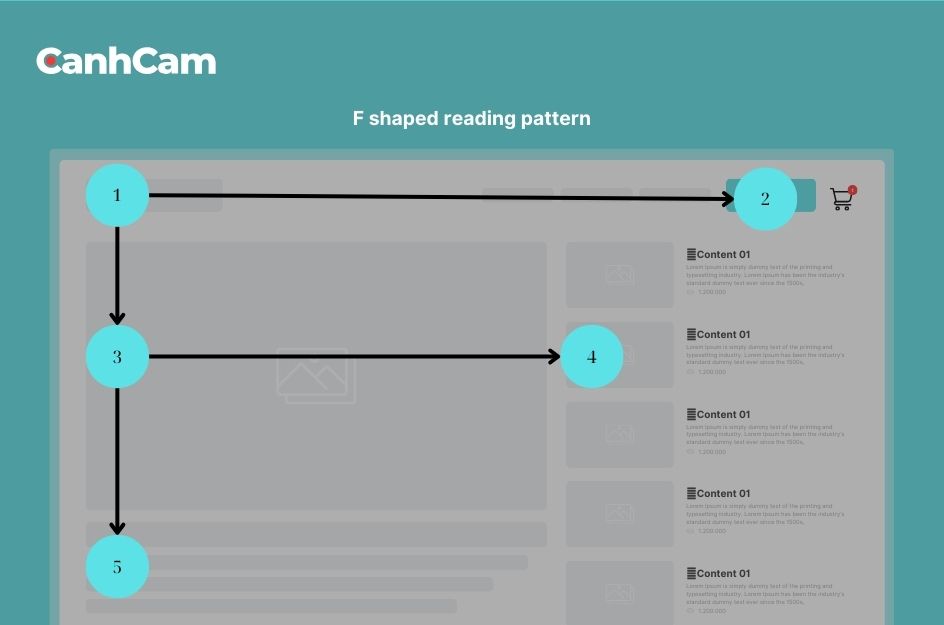
F-Shaped Pattern:
People tend to scan websites in an F-shaped pattern, focusing on the top left, then moving across the top and down a bit on the left side. This means the most important information should be placed in these areas of your homepage.
Focus on User Needs:
When designing your homepage, consider what your visitors are looking for. Make sure your homepage addresses their needs and provides them with the information they want quickly and easily.
Our services: Designer websites in Melbourne

How to Design a Homepage for a Website in Easy Steps?
Designing a website homepage might seem overwhelming at first. But fret not! By following these straightforward steps and focusing on the fundamental building blocks, you can create a homepage that effectively grabs visitors' attention and achieves your website's goals. Regardless of whether you prefer a bold and creative design or a more classic layout, prioritising these core elements will ensure your homepage performs well. In the next steps, we'll delve into these key components, making website homepage design an achievable and enjoyable process:
1. Understanding your Target Audience
A well-designed website homepage starts with understanding your target audience. Their needs and interests should guide everything on your homepage, from the content to the design.
Who are you trying to reach?
By taking the time to identify your ideal customer, you can create a homepage that resonates with them and compels them to take action.
Focus on Their Goals, Not Yours
Instead of simply listing generic website goals, replace them with benefits relevant to your target audience.
- Drive Conversions: Clearly explain how your product or service solves their problems or improves their lives.
- Generate Leads: Highlight valuable content or resources they can access by providing their contact information.
- Provide Information: Present your brand story and value proposition in a way that is easy to understand and directly addresses their needs.
Simple and Clear Communication is Key
Use straightforward language that your target audience can easily comprehend. Avoid technical jargon or industry slang.
By focusing on your target audience and their goals, you can create a website homepage that effectively converts visitors into loyal customers in the first step.

2. Knowing What You Want Your Homepage to Do
Before diving into aesthetics, it's crucial to define your homepage's purpose. What do you want visitors to achieve once they land there after you know your target audience?
- Target Audience Needs First: Think about your ideal customer. What problems do they face, and how can your website offer solutions? Align your homepage goals with these needs by showcasing relevant products, services, or informative content.
- Define Success Metrics: How will you measure if your homepage is working? Consider key performance indicators (KPIs) like conversion rates (sales or sign-ups), bounce rates (visitors who leave quickly), time spent on the page, and click-through rates on calls to action (CTAs).
- Set SMART Goals: Vague goals like "get more sales" lack direction. Instead, craft Specific, Measurable, Achievable, Relevant, and Time-bound goals. Aim for a 20% increase in newsletter sign-ups within the next quarter or a 15% boost in sales conversions by year-end.
- Align with Business Strategy: Your homepage shouldn't exist in a silo. Ensure its goals contribute to your broader business objectives, like increasing brand awareness or driving revenue growth.
- Prioritize User Experience (UX): Design with user needs in mind. Visitors should find what they're looking for quickly and intuitively. Clear navigation, easily digestible content, and prominent CTAs are all crucial for a seamless user experience.
3. Choosing a User-friendly Layout
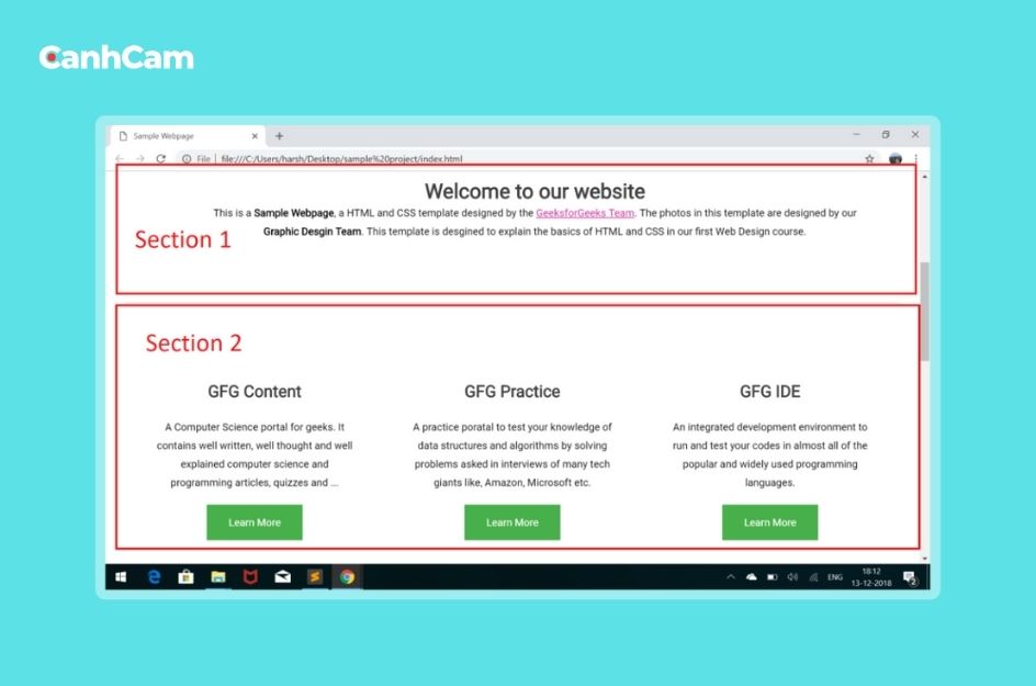
The layout of your website's homepage is crucial for user experience. It directly impacts how easily visitors can find the information they need and navigate your site. Here's why choosing a simple and user-friendly layout is important for this step:
Clarity and Focus: A clear layout guides users towards the most important information on your homepage. This prevents confusion and keeps visitors engaged.
Easy Navigation: A user-friendly layout allows visitors to intuitively find what they're looking for, encouraging them to explore further.
Accessibility: Simple layouts are often easier to navigate for users with disabilities, ensuring a positive experience for everyone.
To create a welcoming and informative first impression for your visitors. This not only improves user experience but also encourages them to take action on your website, whether it's making a purchase, subscribing to a newsletter, or contacting you.
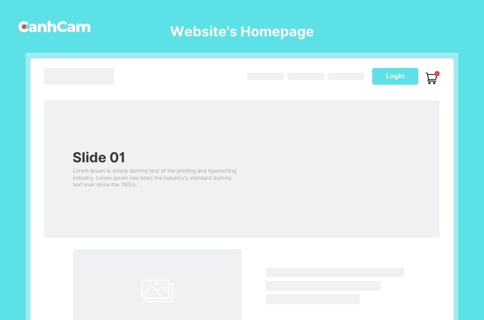
4. Designing a Hero Message for Homepage
Your website's homepage design starts with a strong first impression: the hero message. This is what visitors see first, so it needs to grab their attention quickly. A good hero message is:
- Short and sweet: Get straight to the point and avoid using complex language.
- Visually appealing: Use high-quality images or videos that are relevant to your business.
- Benefit-oriented: Explain how your website can help visitors achieve their goals.
- Actionable: Include a clear call to action button that tells visitors what to do next.
Here's an example:
Headline: Grow Your Business with Our Marketing Software
Subheading: Easy-to-use tools to reach more customers and boost sales.
Call to action: Start Your Free Trial Today!
By following these tips, you can create a hero message that will make a great first impression on your visitors and encourage them to explore your website further.
5. Building Trust with High-quality Content
To build trust and encourage them to explore further, you need high-quality content that demonstrates your expertise and commitment to their needs. Here's how:
- Offer Valuable Information: Provide content that directly addresses your audience's challenges and interests. This can include informative articles, how-to guides, or industry insights that showcase your knowledge.
- Use Clear, Simple Language: Communicate openly and avoid technical jargon or overly promotional language. Focus on clear, easy-to-understand explanations that build trust.
- Showcase Success Stories: Feature testimonials from satisfied customers or showcase real-world examples of your work through case studies. This reassures visitors of your capabilities and reliability.
- Establish Your Authority: Create content that positions you as a leader in your field. This could be whitepapers, research reports, or thought leadership articles that demonstrate your expertise.
- Maintain Consistent Messaging: Ensure your content reflects a consistent brand voice across all platforms, from your website to social media.
- Encourage User Engagement: Welcome reviews, testimonials, and user stories. This builds trust and fosters a sense of community around your brand.
- Keep Content Fresh: Regularly update your website with current information and relevant industry trends. Outdated content can erode trust.
- Be Responsive and Available: Make it easy for visitors to find the information they need and respond promptly to inquiries and feedback. This shows you value their input and are committed to their satisfaction.

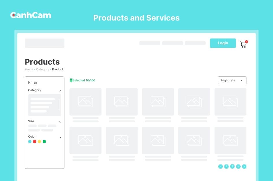
6. Introducing Products and Services on the Homepage
Your homepage serves as the perfect platform to introduce your range of products and services clearly and engagingly. Here are some effective ways to achieve this:
- Highlight Key Features: Show off what you offer with clear, attractive images and icons. Briefly explain each product or service and its benefits.
- Descriptive Headings: Use titles that grab attention and clearly state what each product or service does. This helps users understand your offerings quickly.
- Compelling Descriptions: Explain your products and services in clear and concise details. Focus on what makes them unique and valuable to your target audience.
- Build Trust with Testimonials: Showcase positive reviews or testimonials from satisfied customers to demonstrate the quality and value you provide.
- Clear Calls to Action: Tell visitors what to do next after learning about your offerings. Use buttons or links that say "Learn More," "Buy Now," or "Contact Us" to guide them.
- Offer Additional Resources: Depending on what you offer, provide links to detailed information like product specs, case studies, or white papers for interested visitors.
- Search Engine Optimization: Use relevant keywords throughout your product and service descriptions to help potential customers find you online.
- Track and Improve: Regularly check how your product introductions perform. See how many people click on your call-to-action buttons, how long they stay on product pages, and how many become customers. Use this data to improve your homepage and achieve better results.

7. Using clear calls to action
The question in this part is "Why are CTAs important for the homepage in website design?" A strong CTA can make a big difference in your website's success. It helps you achieve your goals, whether it's getting more leads, increasing sales, or simply getting people to explore your content.
How to create effective CTAs:
- Keep it clear and concise: Use short, action-oriented language that tells visitors exactly what you want them to do. For example, "Buy Now," "Sign Up Today," or "Learn More."
- Make them stand out: Use contrasting colours and prominent placement to ensure your CTAs are easy to see and click.
- Tailor them to your goals: Use different CTAs for different goals. For example, you might use a "Buy Now" CTA for a product page and a "Contact Us" CTA for a service page.
- Test and refine: Track how your CTAs are performing and make adjustments as needed.
The benefits of using CTAs:
- Increase conversions: A well-designed CTA can significantly increase the number of visitors who take the action you want them to take.
- Improve user experience: CTAs guide visitors through your website and help them find the information they're looking for.
- Stronger brand message: CTAs can help summarize your company's value proposition and encourage visitors to learn more.
Don't forget the CTA!
Many websites miss the opportunity to engage visitors with a clear CTA. Including a strong call to action on your homepage is essential for converting visitors into leads or customers.

8. Designing and Testing for Different Devices on Your Homepage
Your website's homepage needs to look good and function flawlessly on all screen sizes, from desktops to smartphones. This is where responsive web design comes in. So, what is Responsive Design in the website design homepage?
Responsive design ensures your homepage automatically adjusts to fit the screen size of the device it's being viewed on. This means clear visuals, easy-to-navigate menus, and readable text, whether someone is using a desktop computer, tablet, or smartphone.
Why is Responsive Design important?
Imagine a potential customer trying to reach your website from their phone. If the text is tiny and hard to read, or buttons are too close together and difficult to tap, they might get frustrated and leave. Responsive design prevents this by keeping your homepage user-friendly across all devices.
Benefits of Responsive Design you should know,
- Reach a Wider Audience: Attract users on any device, increasing website traffic and potential customers.
- Enhance User Experience: Provide a smooth and enjoyable interaction for all visitors, regardless of their device.
- Improve Search Engine Ranking: Search engines favour mobile-friendly websites, which can boost your online visibility.
Testing for Different Devices: It's not enough for your homepage to just look good on the device you use to create it. It should work flawlessly on every device. Designers use various tools to test website responsiveness across different screens. Some popular options include Google DevTools, BrowserStack, and Sizzy.
9. Launching Your Website's Homepage
When launching your website homepage, focus on creating an appealing and user-friendly introduction that aligns with your brand identity. Communicate your value proposition and emphasize what sets your website apart. Make navigation intuitive for visitors to explore different sections seamlessly. Ensure responsive design across devices, prioritize site speed, and implement essential SEO elements for better discoverability.
Test links, buttons, and forms to ensure a smooth user journey. Promote your website through various channels to attract an initial audience. Share the launch on social media and with existing customers.
Regularly update your homepage, using visitor metrics to inform changes. Analyze conversions, and update CTA copy or placement if needed. Optimize website copy based on search engine terms driving new visitors. Learn from popular pages to enhance the performance of others.

Tips for Website Homepage Design
- Brand Consistency: Maintain consistency with your brand colours, fonts, and overall style throughout the homepage.
- Simplicity: Keep the design clean and uncluttered to avoid overwhelming visitors with information.
- Hierarchy of Information: Organize content with a clear hierarchy, prioritizing important information such as key offerings or latest updates.
- Whitespace: Use whitespace effectively to improve readability and draw attention to important elements.
- Loading Time: Optimize the homepage to load quickly on all devices to prevent visitors from bouncing due to slow load times.
- Interactive Elements: Incorporate interactive elements like sliders, accordions, or hover effects to engage users and encourage exploration.
- Contact Information: Ensure contact information is easily accessible, typically in the footer or header, to facilitate communication with visitors.
- Security: Display trust badges or security certifications to reassure visitors about the safety of their data, especially if you're collecting any personal information.
- Localized Content: If applicable, consider including localized content or language options to cater to an international or diverse audience.
- Feedback Mechanism: Provide a way for visitors to leave feedback or ask questions, demonstrating responsiveness and customer service orientation.
Conclusion
In essence, Canhcam has dissected the intricacies of website homepage design, focusing on its key components. The primary goal is clear: the structure, design, and content must collectively fulfil four major objectives for the audience, whether they arrive directly on the homepage or navigate there from an interior page via a search engine.

