In this piece, we delve into personal experiences and insights surrounding Minimalist Website Design. Learn how users and designers perceive and interact with minimalist websites, gaining a deeper understanding of how this influential approach transforms the online experience.
Discover the essence, we navigate spaces blending simplicity, functionality, and personal connection. Join us in exploring the delicate balance between clean aesthetics and meaningful engagement, witnessing firsthand the impact of minimalism on the ever-evolving digital landscape.
Understanding minimalist design
Before we learn about the definitions and differences between minimalism and simplicity in design, how do you understand minimalism?
Let's simplify your thoughts, minimalism is simply a design and lifestyle philosophy that emphasizes simplicity, functionality, and the use of minimal elements to achieve a particular aesthetic or purpose. In various contexts, it can be used in art, design, architecture, lifestyle, and even technology.
A design philosophy that redefines digital experiences by embracing simplicity and functionality. With its core principle of 'less is more,' Minimalist Website Design aims to streamline concepts and user interfaces, eliminating unnecessary embellishments for a more focused online presence.
Now, let's delve into the details.
Defining minimalism in web design
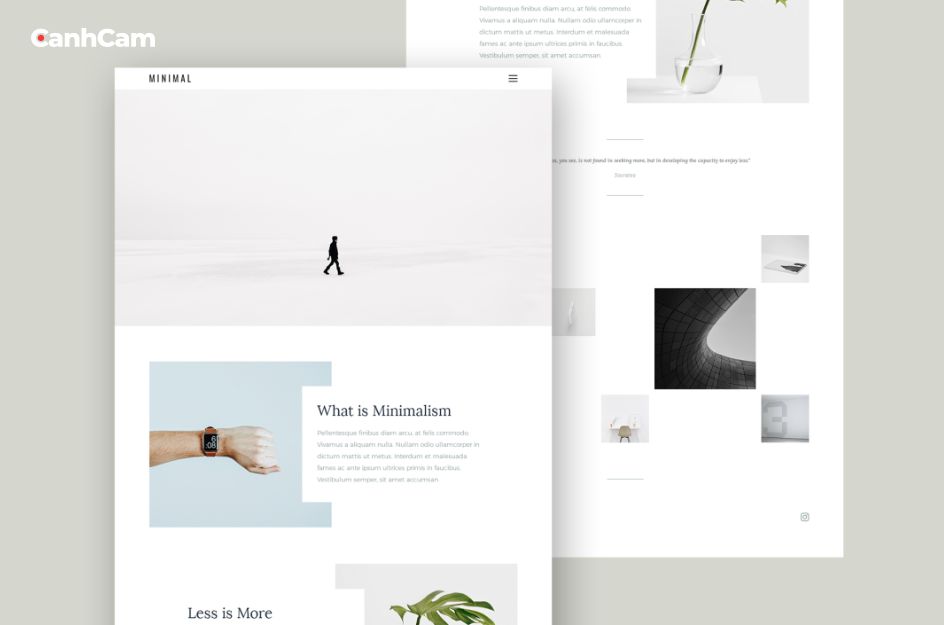
Minimalism in website design is an approach that prioritizes simplicity, concentrating on presenting only the essential elements to users. This design philosophy aims to remove unnecessary embellishments, distractions, and complexities, providing users with a clean and straightforward experience. A minimalist website typically adopts a simple and uncluttered layout, characterized by ample whitespace, a limited color palette, and clear typography.
Navigation is streamlined to facilitate easy access to information without unnecessary complexity. The commitment to minimalism also extends to the use of imagery, where carefully selected, high-quality visuals serve specific purposes. Flat design principles, such as avoiding intricate textures and shadows, contribute to a modern and clean aesthetic.

Ultimately, the objective of minimalistic web design is to create a user-friendly interface that is visually appealing, ensuring that content takes precedence and users can effortlessly engage with the information. This design approach has become popular for its effectiveness in conveying messages while maintaining a sophisticated and uncluttered appearance.
Minimalism and simplicity: what are different?
Minimalism and simplicity are closely interconnected concepts, particularly within the realm of design. Minimalism underscores the reduction of elements to a bare minimum, prioritizing refinement and simplification. In contrast, simplicity accentuates the removal of complexity, aiming to create a design that is clear and easily comprehensible.
Both approaches share the overarching objective of delivering a positive user experience by focusing on the core message and eliminating unnecessary elements. Implementing these principles in designs frequently results in interfaces that are both visually appealing and user-friendly.
Identifying “Unnecessary Elements”
Recognizing "superfluous elements" plays a pivotal role in design, especially within the frameworks of minimalism and simplicity. This entails a concentrated effort to identify components that do not contribute to the fundamental purpose or functionality of the design.
By giving precedence to essential content and functionality, simplifying typography, streamlining navigation, optimizing the color palette, and taking into account user feedback, designers guarantee that each element adds significant value. This methodical approach aids in crafting sleek, uncluttered designs that prioritize both user experience and the effectiveness of communication.
Advantages of minimalist design
Minimalist design provides several advantages that enhance the overall user experience, expedite loading times, and enhance mobile responsiveness. Here are some key benefits:
Better user experience
Minimalist design presents only essential elements for a straightforward and user-friendly interface. This reduces visual clutter, allowing users to focus on the core message or functionality for a more satisfying and efficient experience.
Faster loading times
The simplified essence of minimalist design markedly diminishes the quantity of elements present on a webpage. This encompasses a reduction in images, concise code, and an overall decrease in data payload. Consequently, web pages load at an accelerated pace, affording users a smooth and responsive experience. Quicker loading times not only augment user satisfaction but also play a role in improving search engine rankings, as search algorithms prioritize swift websites.
Improved mobile responsiveness
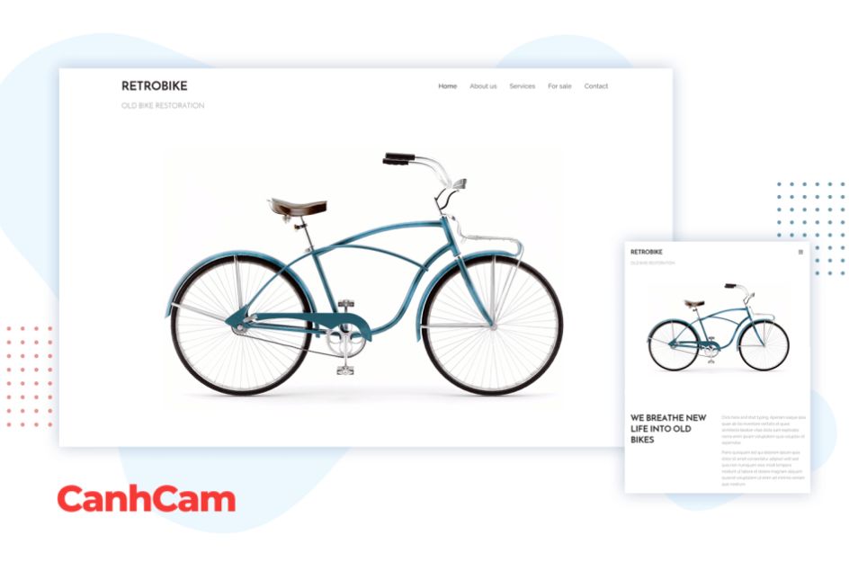
As mobile devices become increasingly ubiquitous, responsive design becomes imperative. Minimalist design, by its very nature, aligns seamlessly with mobile responsiveness, given its focus on simplicity and prioritization of vital content. The removal of non-essential elements facilitates a seamless adaptation to smaller screens, guaranteeing a consistent and optimized experience for users on mobile devices.
Key elements of minimalist design
Simple color schemes
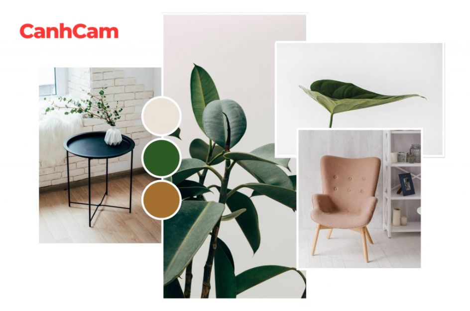
Minimalist designs typically embrace a restrained selection of colors, frequently opting for a monochromatic or neutral palette. This intentional decision aims to keep the spotlight on the essential elements of the design. Through the reduction of color diversity, the overall visual impact is subdued, fostering a feeling of tranquility and clarity. This simplicity further enhances the overall coherence and consistency of the design, establishing a sense of unity and harmony.
Readable typography
Preferential treatment is given to clean and legible fonts over intricate and decorative ones in minimalist designs. Generally, sans-serif fonts are favored for their simplicity and straightforwardness. This preference ensures that textual content is readily readable and understandable, thereby enhancing the overall user experience. The focus on readability aligns with the minimalist philosophy of eliminating distractions and allowing the content to take center stage.

Ample whitespace
The hallmark of minimalist design is generous whitespace, which refers to the deliberate absence of unnecessary visual elements. Whitespace, or negative space, creates breathing room around design elements, allowing essential components to stand out. Minimalist designs achieve balance, elegance, and clarity through strategic use of whitespace, eliminating visual clutter and focusing on content.
Additionally, minimalist design features limited navigation options, streamlining and simplifying the user experience. This approach reduces cognitive load, making it easier for users to locate essential information by guiding them toward crucial sections and avoiding overwhelming choices.
Implementing minimalism
Grid-based layouts
Minimalist design often finds its foundation in grid-based layouts. These layouts provide a systematic structure for organizing content, offering both aesthetic appeal and functional efficiency. The use of grids, whether symmetrical or asymmetrical, enables designers to maintain consistency in spacing, alignment, and proportions. This disciplined approach creates a visually pleasing and organized interface that resonates with the core tenets of minimalism.
Streamlined navigation:
At the core of minimalist navigation lies simplicity. Designers attain streamlined navigation by restricting the number of menu items, choosing clear labels, and adopting hidden or collapsible menus. This intentional reduction in options enhances the user experience, enabling intuitive and unobtrusive navigation. The inclusion of a hamburger menu, particularly on smaller screens, epitomizes the minimalist philosophy of showcasing only essential elements.
Visual hierarchy techniques:
Visual hierarchy plays a crucial role in directing users through the design, emphasizing pivotal elements and content. Minimalist designs utilize variations in font size and weight, a limited color palette, and deliberate whitespace to establish a distinct hierarchy. By ensuring that crucial information stands out, designers craft a user experience that is not only visually pleasing but also functional and user-friendly.
Challenges and considerations
Balancing aesthetics and functionality
The key to minimalist design is finding a balance between aesthetics and functionality. While using a restrained color palette, simple typography, and ample white space enhances visual appeal, it's crucial not to compromise usability. Navigation menus, search bars, and call-to-action buttons should remain easily accessible and intuitive, prioritizing a smooth user experience. Striking a balance between aesthetics and functionality may present a challenge, but the ultimate goal is to create a smooth user experience.
Ensuring accessibility
Although simplicity can improve usability, it may present challenges for specific users, including those with visual or cognitive disabilities. Design decisions should not prevent anyone from accessing and interacting with the website or application. Incorporating alternative text for images, maintaining adequate color contrast, and establishing clear navigation structures are crucial factors for ensuring accessibility. Additionally, the use of scalable fonts and consideration for various screen sizes and devices contribute to the overall accessibility of the design.

Addressing SEO implacts
Minimalist designs, characterized by fewer elements and reduced content on a webpage, can impact search engine visibility. Search engines depend on relevant content and textual signals to rank web pages. Hence, it is crucial to ensure that essential information, metadata, and keywords are present when embracing minimalism.
Striking a balance between minimalism and providing sufficient textual cues for search engines to comprehend the page's purpose is essential for maintaining favorable SEO rankings. Moreover, considerations such as using descriptive heading tags, incorporating relevant keywords, and optimizing page speed should be taken into account for effective SEO.
Tools and resources
Design software
Designers have various options based on preferences and skills. Adobe Photoshop is widely used for digital art and image manipulation, offering powerful tools. Illustrator, also from Adobe, is favored for its scalability in minimalist designs. Specialized tools like Sketch and Figma cater to UI/UX designers, providing visual interfaces and collaboration features for minimalistic app and web designs.
Typography tools
The careful selection of appropriate fonts plays a crucial role in elevating the visual appeal of a minimalist design. Various font tools exist to aid in the exploration of designs and the choice of well-suited typefaces. Take Google Fonts, for instance, which presents an extensive collection of open and free fonts encompassing diverse weights and styles. Its user-friendly interface facilitates easy exploration and selection of fonts. Additionally, Adobe Fonts, formerly recognized as Typekit, provides a range of high-quality fonts that align well with the principles of minimalist design.

Use testing platforms
Incorporating user testing is indispensable to guarantee that minimalist design not only prioritizes aesthetics but also upholds functionality and user-friendliness. Platforms like UserTesting and Optimal Workshop provide users with the ability to remotely assess the user experience of a design, gathering valuable insights on usability and design effectiveness. These platforms incorporate features such as screen recording, heat map analysis, and user surveys, empowering designers to gain a comprehensive understanding of user behavior and preferences.
Trends and Innovations
The trends in minimalist design have progressed, emphasizing simplicity and user-centric experiences. The incorporation of emerging technologies, such as augmented reality (AR) and virtual reality (VR), has enabled the creation of immersive yet minimalist interfaces. Responsive design and innovative typography are crucial elements, ensuring flexibility across various devices and effective communication of messages.
Tools for collaboration, like Figma, enhance efficiency and contribute to the development of polished minimalist outcomes. In summary, minimalist design remains innovative, staying in line with user preferences and embracing advancements in technology.
Frequently Asked Questions (FAQs)
1. How do I make my website minimalistic?
To design a minimalist website, focus on simple and clear layout. Try applying a monochromatic color palette with very few colors and a lot of white space. Choose a simple, easily readable font. Make navigation easy by a menu that is clear and short.
2. What is minimalist UX design?
The concept of "Minimalist" implies emphasizing clean white spaces devoid of unnecessary appliances or decorative elements that serve no purpose. However, achieving minimalism in design does not require stripping a website or software of all functions except the most essential ones.
Conclusion and future outlook
In conclusion, minimalist design serves as a testament to the enduring influence of simplicity in the creative realm. Through our exploration, we have unveiled the diverse advantages of this aesthetic approach. From improved user experiences and expedited loading times to the advancement of visual hierarchy and accessibility, minimalist design has demonstrated its versatility across various domains.
As we contemplate these benefits, it is worthwhile to anticipate future trends in minimalist design. With technology perpetually evolving, minimalist principles are likely to adapt seamlessly and integrate into emerging platforms. The emphasis on functionality, user-centricity, and the delicate balance between aesthetics and usability will continue to be crucial in shaping the next wave of minimalist design.
In a world where information overload is prevalent, minimalist design not only provides a visual respite but also offers a strategic and purposeful path forward. Its capacity to convey a message with clarity and impact ensures that minimalist design will persist as a guiding force in the evolving landscape of creativity and user experience.

