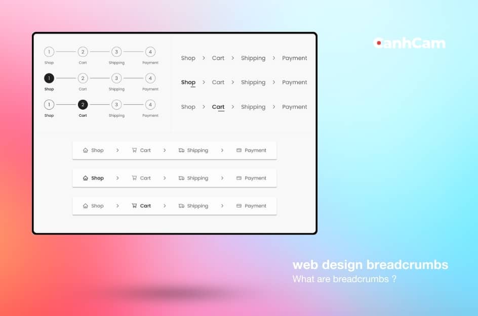
Web design breadcrumbs function like signposts, guiding users through your website and showing them their current location. Just like breadcrumbs left on a trail, they help users find their way back to the homepage or previous sections.
This makes navigating your website smoother and enhances the overall user experience. A positive user experience is a ranking factor for search engines, so breadcrumbs can indirectly contribute to your website's SEO performance.
Additionally, breadcrumbs can:
- Help search engines understand your website structure: Clear breadcrumbs make it easier for search engines to crawl and understand the hierarchy of your website's content.
- Improve website usability: Breadcrumbs provide users with a clear path to navigate back to previous sections or the homepage, making it easier for them to find the information they need.
In this article, we'll explain everything about breadcrumbs in website design.
What is Breadcrumbs in Web Design?
Web design breadcrumbs are navigational elements that help users orient themselves on a website. Just like breadcrumbs left on a trail, they show the path a user took to get to the current webpage.
Imagine you're browsing an online shoe store, and you land on a specific running shoe page. Breadcrumbs might display "Home > Shoes > Running Shoes > Nike". This tells you exactly where you are within the website's structure.
With a single click on any breadcrumb link, you can navigate back to a previous section (Home, Shoes, Running Shoes). This makes it easy to explore different categories without getting lost on the website.
Website Design Services: Creative website design in Melbourne

How to Add Breadcrumbs to Your Website?
Breadcrumbs are a great way to enhance the user experience on your website, especially in web design. They provide users with an easy way to navigate back to previous pages and track their progress within your website. Breadcrumbs typically display the hierarchy of pages leading to the current page. Here's a step-by-step guide on how to do it:
1. Understand Breadcrumb Types
There are three main types of breadcrumbs:
- Location-based: Shows the path to the current page in the hierarchy.
- Attribute-based: Based on categories or attributes, often used in e-commerce.
- History-based: Shows the user's path through the site.
2. Choose the Breadcrumb Type
Select the breadcrumb type that suits your website's structure and purpose.
3. Design the Breadcrumb
Design your breadcrumb trail using CSS for styling and HTML for structure.
4. Implementing Breadcrumbs with HTML and CSS
Basic HTML Structure
Here’s a basic HTML structure for a location-based breadcrumb:
<nav aria-label="breadcrumb">
<ol class="breadcrumb">
<li class="breadcrumb-item"><a href="/home">Home</a></li>
<li class="breadcrumb-item"><a href="/category">Category</a></li>
<li class="breadcrumb-item active" aria-current="page">Current Page</li>
</ol>
</nav>
CSS Styling
Style the breadcrumb to match your site's design:
.breadcrumb {
display: flex;
list-style: none;
padding: 0;
margin: 0;
}
.breadcrumb-item + .breadcrumb-item::before {
content: ">";
padding: 0 0.5rem;
color: #555;
}
.breadcrumb-item a {
text-decoration: none;
color: #007bff;
}
.breadcrumb-item.active {
color: #555;
}
5. Add Breadcrumbs to Your Web Pages
Insert the breadcrumb HTML into the appropriate section of your web pages, usually at the top.
6. Use Microdata for SEO
Enhance your breadcrumbs with Schema.org microdata to help search engines understand the structure. Here’s how to modify your HTML:
<nav aria-label="breadcrumb">
<ol class="breadcrumb" itemscope itemtype="http://schema.org/BreadcrumbList">
<li class="breadcrumb-item" itemprop="itemListElement" itemscope itemtype="http://schema.org/ListItem">
<a href="/home" itemprop="item"><span itemprop="name">Home</span></a>
<meta itemprop="position" content="1" />
</li>
<li class="breadcrumb-item" itemprop="itemListElement" itemscope itemtype="http://schema.org/ListItem">
<a href="/category" itemprop="item"><span itemprop="name">Category</span></a>
<meta itemprop="position" content="2" />
</li>
<li class="breadcrumb-item active" aria-current="page" itemprop="itemListElement" itemscope itemtype="http://schema.org/ListItem">
<span itemprop="name">Current Page</span>
<meta itemprop="position" content="3" />
</li>
</ol>
</nav>

Breadcrumbs are especially useful on mobile devices, where screen space is limited.
7. Implement Breadcrumbs with JavaScript (Optional)
If your site has dynamic content, you may need JavaScript to generate breadcrumbs:
document.addEventListener('DOMContentLoaded', function() {
var breadcrumbContainer = document.querySelector('.breadcrumb');
var breadcrumbs = [
{ name: 'Home', url: '/home' },
{ name: 'Category', url: '/category' },
{ name: 'Current Page', url: '/current-page' }
];
breadcrumbs.forEach(function(crumb, index) {
var li = document.createElement('li');
li.className = 'breadcrumb-item';
if (index === breadcrumbs.length - 1) {
li.className += ' active';
li.setAttribute('aria-current', 'page');
li.textContent = crumb.name;
} else {
var a = document.createElement('a');
a.href = crumb.url;
a.textContent = crumb.name;
li.appendChild(a);
}
breadcrumbContainer.appendChild(li);
});
});
```
8. Testing and Validation
Ensure your breadcrumbs are working correctly across all pages. Validate the HTML and microdata using tools like Google's Structured Data Testing Tool.
9. Responsive Design
Make sure the breadcrumbs are responsive and look good on all devices. Adjust CSS as needed for different screen sizes. By following these steps, you can effectively add breadcrumbs to your website, enhancing both navigation and SEO.
When to Use Web Design Breadcrumbs
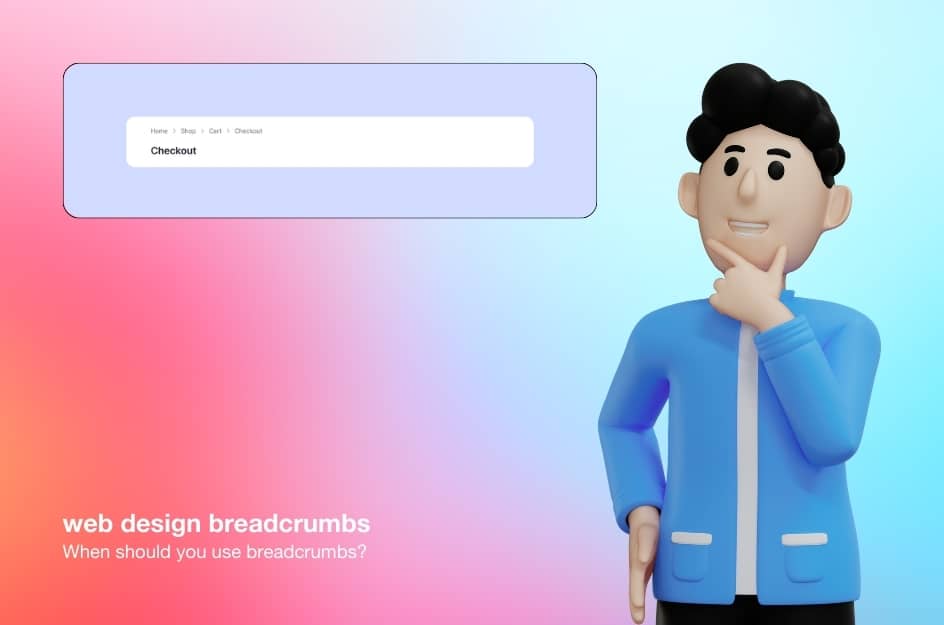
Breadcrumbs are most beneficial for websites with complex structures. This includes websites with many pages organized into categories and subcategories, often referred to as a hierarchical structure. A good example of this is a large ecommerce website where products are grouped by type and then further categorized by brand, size, or colour.
Websites with very few pages or a simple layout typically won't need breadcrumbs. Imagine a website with just a contact page, an about us page, and a homepage. In this case, breadcrumbs wouldn't provide much value.

To determine if your website would benefit from breadcrumbs, try creating a sitemap. A sitemap is a visual representation of your website's structure, showing how pages connect. If your sitemap looks complex with many branches, breadcrumbs can be a helpful tool for users to navigate those connections.
But, the breadcrumbs are meant to complement your main navigation menu, not replace it. They offer an additional way for users to understand their location on your website and provide an alternative navigation option.
Types of Breadcrumbs in Website Design
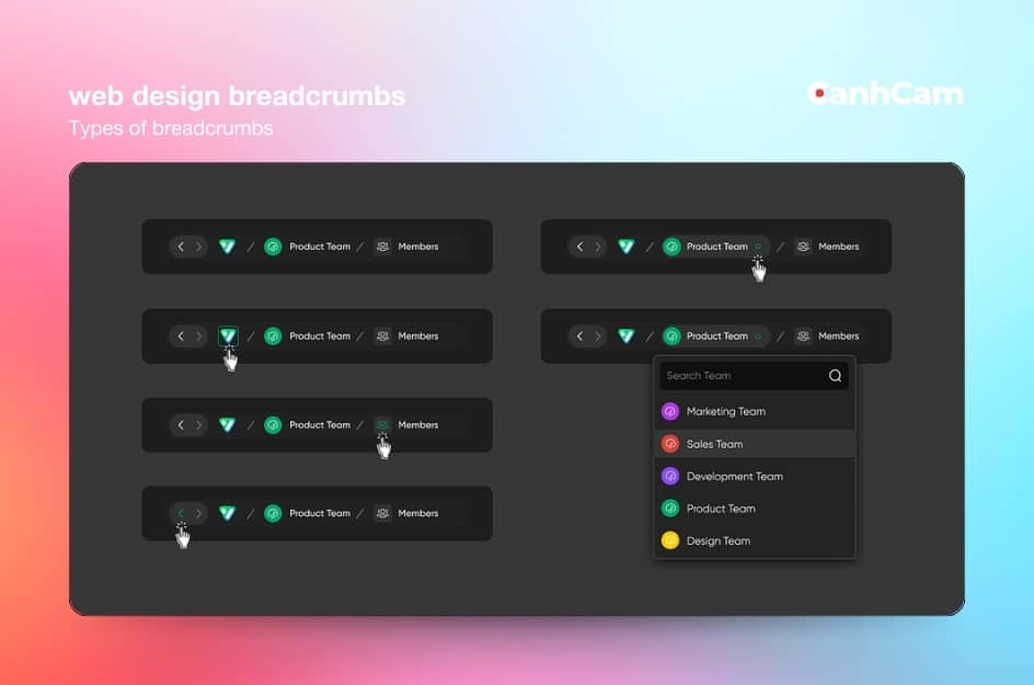
They typically appear near the top of a webpage and function like a roadmap, showing the user's path from the homepage to the current page. There are three main types of breadcrumbs, each offering distinct benefits:
Location-based
Location-based breadcrumbs are the most common type of breadcrumbs and simply show the user where they are within the website’s hierarchy. For example, a location-based breadcrumb might look like:
“Home> Products> Cameras> Digital Cameras”
To indicate that the users who want to quickly navigate back to a previous page or section of the website without having to click the back button repeatedly.
Attribute-based
Attribute-based breadcrumbs, on the other hand, provide additional information about the current beyond just its location in the website’s hierarchy. This type of breadcrumb might include filters or attributes that the user applied to reach the current page. For example, an attribute-based breadcrumb might look like:
“Home > Products > Cameras > Digital Cameras > Price: $500 - $1000”
To indicate that the user is viewing digital cameras in a specific price range.
Attribute-based breadcrumbs can help users remember the criteria they used to find a certain page and can be especially useful for e-commerce websites with a large number of products.

Designers can customize breadcrumbs for style and placement to suit the website's design.
Path-based
Path-based breadcrumbs display the user’s entire path from the homepage to the current page and can help them retrace their steps if needed. Path-based breadcrumbs are especially useful for websites with complex structures or multiple ways to navigate to the same page.
For example: Previous Page> Previous Page> Current Page
Each type of breadcrumb serves a different purpose, but they all aim to improve navigation and provide users with context about their location within a website or application
Benefits of Using Breadcrumbs
Convenient for Users
Breadcrumbs provide users with a clear and easily accessible way to navigate a website, especially if the site has multiple levels of navigation.
With breadcrumbs, users can quickly understand where they are within the website and easily retrace their steps if necessary. This can be particularly helpful for users who may be new to a website or may not be familiar with its structure
Improves Navigation Efficiency
Instead of having to click “back” multiple times or navigate through multiple menus, users can simply click on the breadcrumbs trail to go back to a previous page. This not only saves time and effort for users but also provides a more seamless and efficient browsing experience
Reduced Bounce Rates
Bounce rate refers to the percentage of visitors who navigate away from a website after viewing only one page. By providing clear navigation and context for users, breadcrumbs help them understand the structure of the site and easily find other relevant content. This can encourage users to explore more pages on the website, ultimately reducing bounce rates and increasing engagement.

SEO Benefits
Search engines like Google value websites that are easy to navigate and provide a good user experience. By including breadcrumbs on a website, search engines can better understand the hierarchy and structure of the site, which can lead to higher rankings in search results.
Breadcrumbs also create additional internal links on a website, which can improve the overall SEO performance by helping search engines discover and index more pages.
Enhanced User Experience
Breadcrumbs enhance the user experience by providing an additional way for users to navigate a website. Breadcrumbs offer an alternative navigation option to the main menu or search bar, allowing users to easily backtrack or explore related content.
This can be particularly useful for websites with deep hierarchies or a large number of pages, as breadcrumbs provide a more efficient way for users to navigate the site.
Overall, incorporating breadcrumbs into a user interface can contribute to a more intuitive and user-friendly experience, leading to higher user satisfaction and engagement.
No misinterpretation
A major advantage of utilizing breadcrumbs is their ability to prevent misunderstandings. By offering a straightforward route for users to track, breadcrumbs mitigate confusion and reduce the likelihood of users becoming disoriented within a website. This is especially crucial for websites featuring intricate layouts or numerous layers of navigation, as users can easily lose their sense of location.
Effective use of screen space
Breadcrumbs aid in maximizing screen space utilization on a website. They offer a succinct and transparent representation of a user's position within the website's structure, enabling swift navigation across pages without consuming excessive screen area. This enhances user experience and facilitates efficient access to desired information.
Practices for Breadcrumbs
Here is a series of tips and UX design methods that can help you master navigation as a supportive and convenient element in web navigation. Remember that none of these methods are a one-size-fits-all solution for any website: The examples below show how different products approach this navigation component to meet their priorities.
Avoid Using Breadcrumbs for Main Navigation
While breadcrumbs can be a useful secondary navigation tool, they should not take the place of a main menu or other primary navigation elements. Breadcrumbs are meant to supplement navigation, not replace it, so it's important to ensure that they are used in conjunction with other navigation tools to provide a seamless user experience.
Place Breadcrumbs Above The H1 Heading
Positioning breadcrumbs above the main heading (typically denoted as H1 in HTML) ensures they are prominently displayed and easily noticeable. Placing breadcrumbs at the top of a page makes them easily visible and accessible to users, allowing them to quickly see their path through a website and navigate back to previous pages if needed.
Placing breadcrumbs above the H1 heading also helps to establish a clear hierarchy on the page, with the breadcrumbs signalling the user's path through the site and the H1 heading indicating the main topic of the page
Home in Breadcrumbs
Initiating the breadcrumb trail with a link to the home page allows users to easily navigate back to the starting point of the website. This helps users establish their location within the website hierarchy from the very beginning and provides an easy way for them to navigate back to the home page if needed. Starting a breadcrumbs trail with a link to the home page also reinforces the website's branding and helps to establish a sense of familiarity and consistency for users as they navigate through the site.
Make The Current Location Look Non-Clickable
The initial step involves rendering the current location in the breadcrumb trail as non-clickable. This aids users in recognizing that the link corresponding to their current position is inactive, thus averting potential confusion or frustration resulting from futile attempts to click on it.
Employing distinct text attributes such as colour, style, or symbols to delineate the present location enables users to swiftly discern their position within the site hierarchy, mitigating the risk of inadvertently selecting an incorrect link.
Separate The Elements
Each link in the breadcrumb should be distinct and easy to read, with enough spacing between them to prevent accidental clicks. By using visual cues such as arrows or slashes to separate the elements, users can easily follow the path back to previous pages and understand how each link relates to the others.
Mind readability and white space
The third guideline emphasizes considering readability and white space in breadcrumb design. Selecting a font size and style that is clear and legible is crucial, particularly for users with visual impairments. Furthermore, incorporating sufficient white space around the breadcrumb trail directs the user's focus towards the links and enhances readability.
Through careful adjustment of spacing and alignment within the breadcrumb elements, users can navigate the website with greater ease, locating desired information without encountering confusion.
Show hierarchy, not history
Breadcrumbs should reflect the actual structure of the website, rather than simply listing the pages that the user has visited in their current session. This allows users to easily understand where they are within the website's structure and navigate to higher-level categories or pages if needed.
Avoid overcrowding the page
Avoid overcrowding the page with an excessive number of breadcrumb elements or additional navigation options. Maintaining a clean and uncluttered design ensures that users can focus on the content and navigate the website without distraction.
Avoid visually highlighting
While breadcrumbs should be visible and easily accessible, they should not overshadow other important elements on the page. Maintain a balanced visual hierarchy within the webpage layout to ensure that breadcrumbs do not dominate the user's attention.
Avoid employing multiple lines
Adapt the design of breadcrumbs for mobile devices to ensure they remain concise and easily accessible without occupying too much screen space. Avoid wrapping breadcrumbs onto multiple lines, as this can detract from the usability and aesthetics of the mobile layout.
Avoid implementing breadcrumbs on the website
Breadcrumbs are most effective for websites with a hierarchical structure, where users navigate through multiple levels of content. Avoid using breadcrumbs for websites with a flat or simple navigation hierarchy, as they may not provide significant value to users in such contexts.
Conclusion
In conclusion, breadcrumbs serve as invaluable signposts guiding users through the labyrinth of websites, enhancing navigation and improving the overall user experience. By offering clear pathways to retrace steps or explore hierarchical structures, breadcrumbs contribute to reducing bounce rates, increasing accessibility, and providing context within the website's organization.
Whether implemented through HTML/CSS, JavaScript libraries, CMS plugins, or custom code, breadcrumbs offer significant benefits for both website owners and users alike.
As websites continue to evolve in complexity, the importance of intuitive navigation aids like breadcrumbs cannot be overstated. Thus, integrating breadcrumbs into web design remains a fundamental practice to ensure seamless navigation and optimal user engagement in the digital landscape.
Frequently Asked Questions
1. How do breadcrumbs affect SEO?
Breadcrumbs provide SEO and user experience benefits. They can increase conversions by making it easier for users to explore a site. Increased interaction leads to lesser bounce rates as well. Breadcrumb schema markup can help a web page appear in search results for a breadcrumb term.
2. Are breadcrumbs good for UX?
Yes, breadcrumbs improve UX by enhancing navigation clarity and helping users understand their location within a website. The turn-by-turn directions help people to understand their location, therefore saving their mental energy.

