This guide will explain how to make effective website wireframes, from basics to tools and examples. Whether you're new to web design or experienced, we aim to give you useful tips to improve your website creation process.
Think of wireframes as the blueprint for your website—they're like the skeleton that holds everything together. They show the layout and how things will work, guiding both designers and developers. Despite looking simple, wireframes are where creativity begins.
They're the foundation for amazing online experiences. Join us as we explore the world of web design wireframes, where simplicity meets complexity, and every detail holds potential.
What is a Wireframe in Website Design?
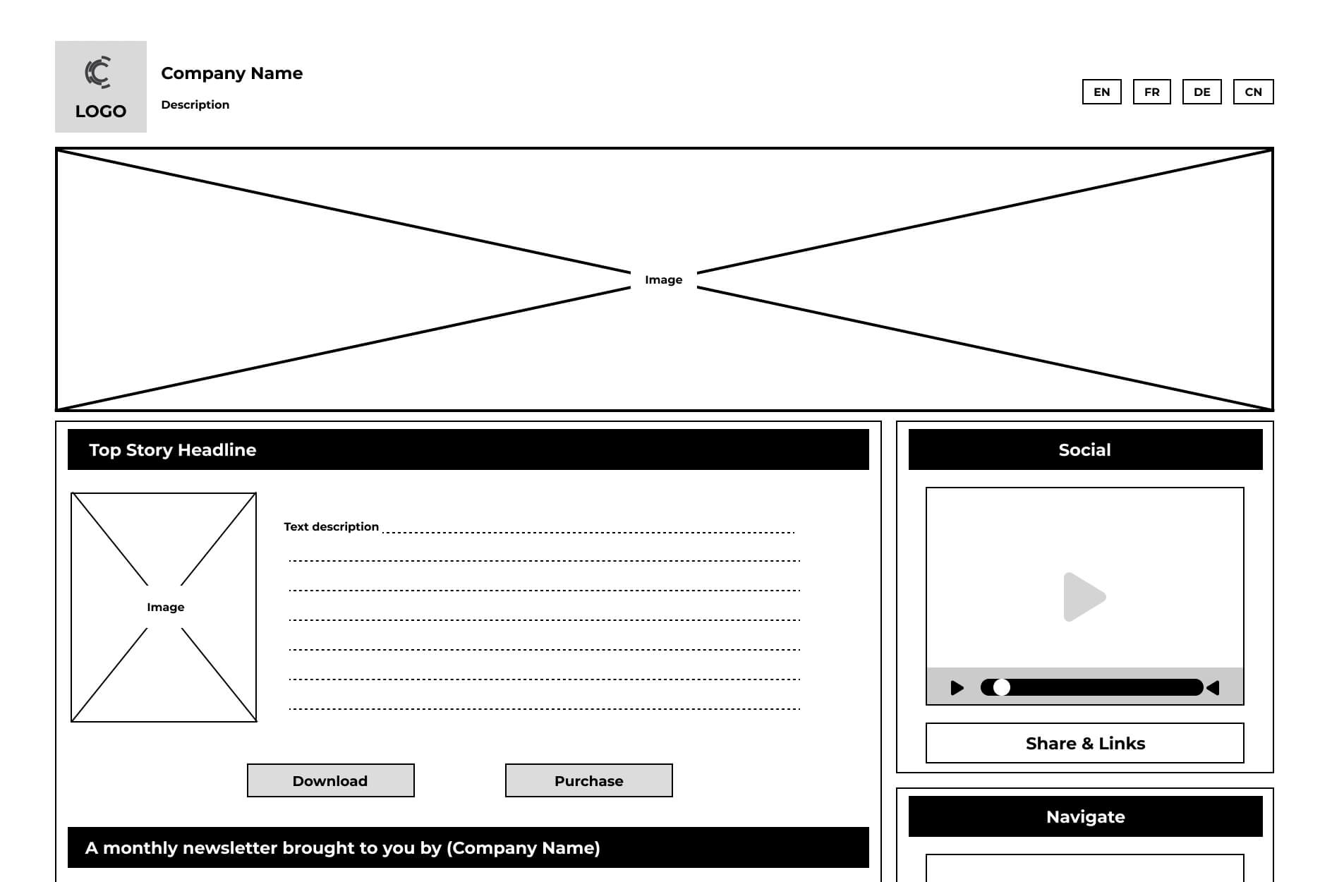
A website wireframe is a low-fidelity blueprint for a webpage. It's a basic sketch that outlines the structure and information hierarchy, including menus, buttons, images, content areas, and other UI elements. Wireframes focus on functionality and user experience rather than visual design aspects like colour or font.

Think of them as a rough draft to plan how a website will function before making it look pretty. They help designers and developers figure out how to arrange elements like buttons and forms, making sure everything works well for users. Wireframes are handy for discussing ideas and testing prototypes before building the final website.
How do You Create a Simple Wireframe in Website Design?
Now that we understand the importance of website wireframing and what a website wireframe is let's dive into the process of creating a simple wireframe. Below are seven key steps to guide you through the process:
1. Identify The Goal of The Website:
Before diving into wireframing, clarify the purpose and objectives of your website. Define your target audience, key messaging, and desired outcomes to inform the wireframe design.
2. Understand the User Flow:
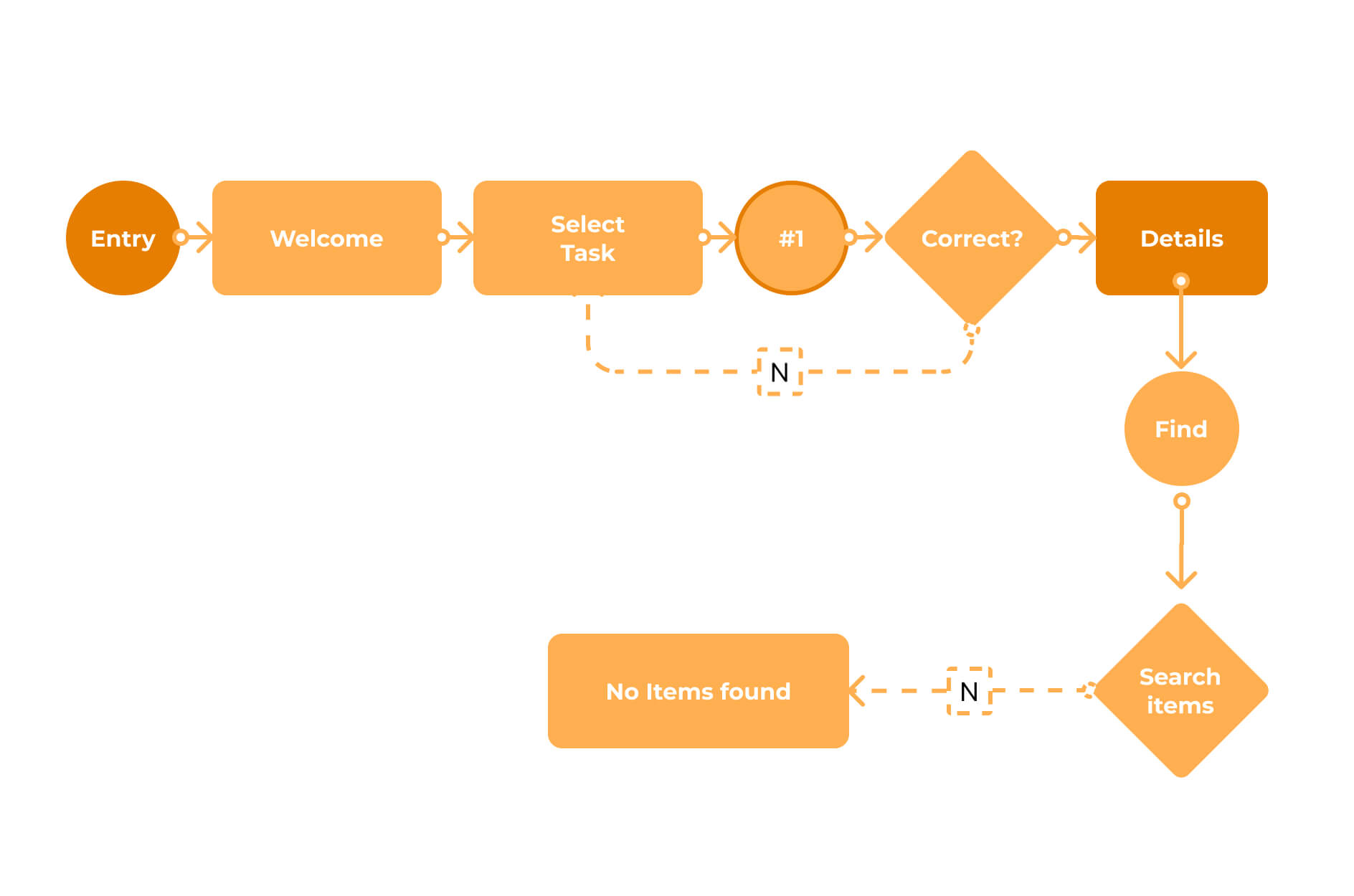
Map out the user journey through the website, from initial entry points to conversion actions. Identify the primary pathways users will take and prioritize the most important content and features accordingly.

3. Determine Your Website Wireframe Size:
Consider the various devices and screen sizes your website will be viewed on, including mobile phones, tablets, and desktop computers. Customize your wireframe dimensions to accommodate different screen resolutions effectively.
1. Wireframe sizes for mobile screens:
- Width: 1080 pixels
- Height: 1920 pixels
2. Wireframe sizes for tablet screens:
- 8-inch tablet: Width 800 pixels x Height 1280 pixels
- 10-inch tablet: Width 1200 pixels x Height 1920 pixels
3. Wireframe size for desktop screens:
- Width: 1366 pixels
- Height: 768 pixels
4. Begin your Website Wireframe Design:
Start sketching out the basic layout of your website, focusing on the placement of key elements such as headers, navigation menus, content sections, and call-to-action buttons. Keep the design simple and focused on functionality.
5. Determine Conversion Points:
Identify the specific actions you want users to take on each page of your website, whether it's signing up for a newsletter, making a purchase, or contacting your business. Highlight these conversion points in your wireframe design to guide user interactions.

6. Remove Redundant Steps:
Streamline the user experience by eliminating unnecessary steps or elements that could potentially confuse or distract users. Simplify the navigation flow and prioritize content based on user needs and preferences.
7. Get Feedback on The Wireframe:
Once you've created a preliminary wireframe, solicit feedback from stakeholders, clients, or other members of your team. Use their input to refine and iterate on the design before moving forward with the development phase.
By following these steps, you can create a simple yet effective website wireframe that lays the foundation for a successful web design project.
Types of Wireframe
To further illustrate the concept of website wireframing, let's explore some examples of different wireframe types:
| Type | Description | Focus |
| Sketch | Hand-drawn, quick visualization | Brainstorming ideas, layout structure |
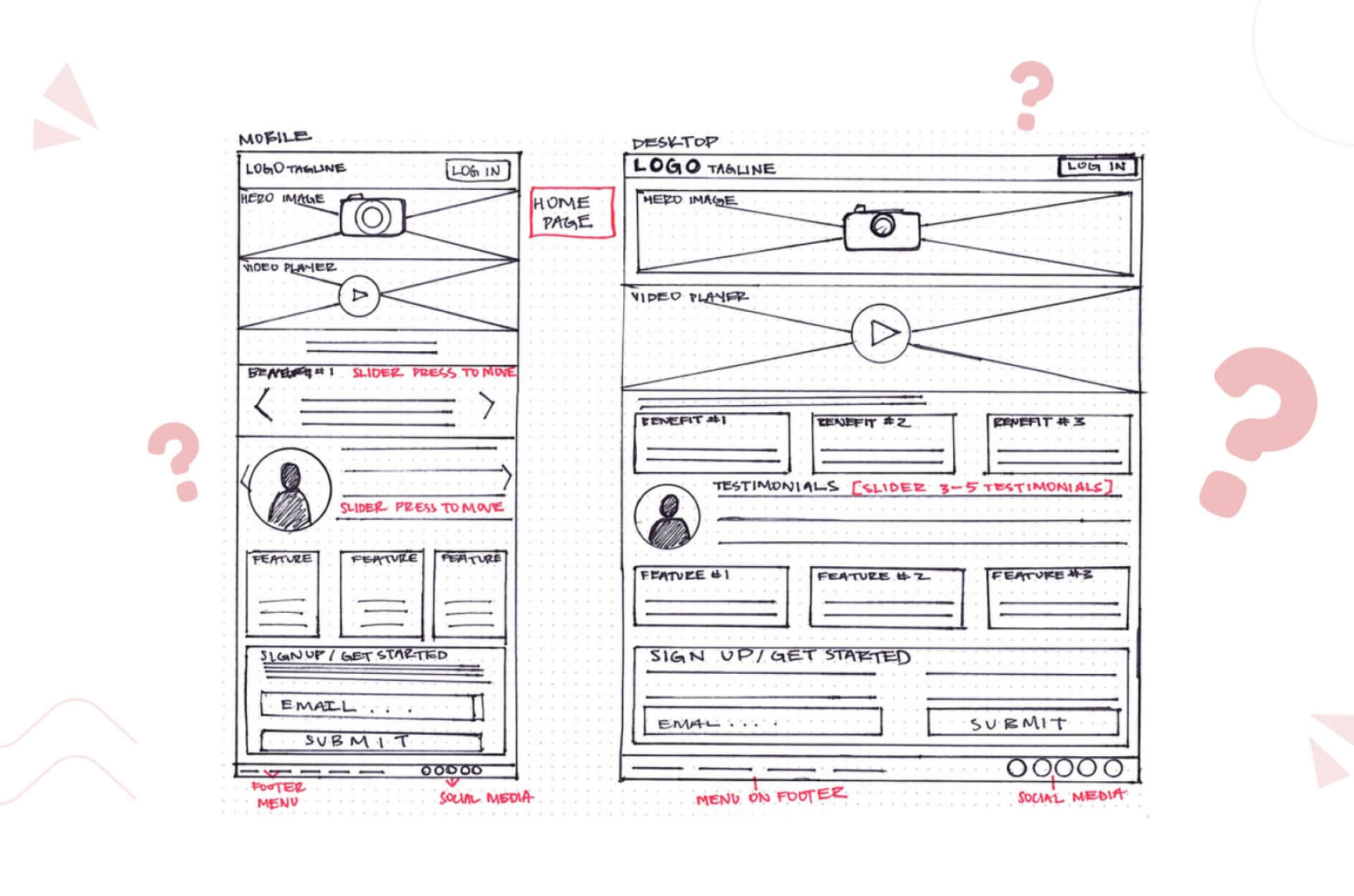
| Detailed Hand-Drawn Wireframe | Enhanced sketch with annotations | A clearer picture of layout and functionality |
| Low-Fidelity Wireframe | Simple shapes and placeholders | Content hierarchy, layout (not design details) |
| Low-Fidelity Mobile Wireframe | Low-fidelity for mobile devices | Responsive design, mobile navigation |
| High-Fidelity Wireframe | Includes typography, colours, imagery | Polished representation of the final design |
| Low-Fidelity Interactive Wireframe | Clickable buttons and links | Simulate browsing experience, test usability |
| Wireframe Mockup | Combines wireframes with visual design elements | Realistic representation of layout and aesthetics |
| Interactive Wireframe Mockup | Interactive prototype for user interaction | User feedback on usability and functionality |
| Free Website Wireframe | Customizable online templates | Convenient starting point for design |
| Mobile Website Wireframe | Focused on mobile websites/apps | Simplicity, usability for smaller screens |
Choose your Wireframing Tools for Website
By exploring these wireframe examples, you can gain a better understanding of the different approaches to website wireframing and choose the one that best suits your project needs.
- Wireframe.cc: Great for beginners or solo website owners without design skills. Its simple interface and basic colour options allow easy drag-and-drop design creation, along with annotation features for keeping track of important details.
- Wirify: This tool turns web pages into wireframes, perfect for revamping websites rather than starting from scratch.
- Balsamiq: A paid tool for collaborative wireframing, mainly focusing on static designs, suitable for teams and professionals.
- Prott: More than just wireframing, Prott also helps with prototyping. It supports teamwork, allowing customization of UI toolkits and design standards.
- Figma: A versatile option for wireframing, prototyping, and interactive prototypes, offering flexibility for various design tasks.
- Adobe XD: Part of Adobe CC suite, tailored for product design. Despite Figma incorporating some Adobe XD features after the acquisition, Adobe CC suite still provides tools for wireframing, modelling, and prototyping.
Mockup vs. Wireframe vs. Prototype
Before we conclude, let's shortly the difference between mockups, wireframes, and prototypes to avoid any confusion:
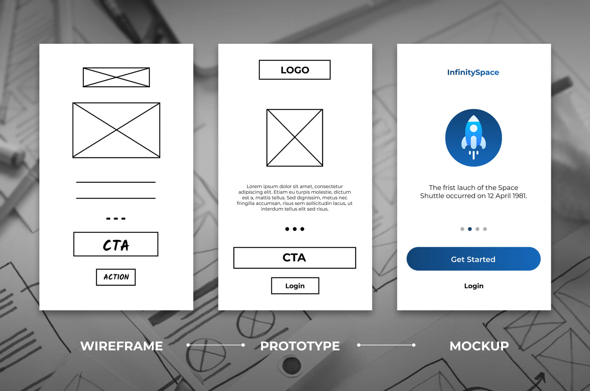
- Wireframe: Think of a wireframe as a simple blueprint of a website's layout. It focuses on where things go and how users move through the site without worrying about colours or fancy design.
- Mockup: A mockup is like a polished preview of the website. It includes colours, fonts, and images, giving a clear picture of how the final website will look. But it's still just a picture, not something you can click or interact with.
- Prototype: Now, a prototype is the real deal. It's an interactive version of the website or app. You can click around, test buttons, and see how everything works together. Prototypes are crucial for figuring out how users will use the website or app.

Understanding these differences is super important for making sure your website or app turns out just right. Before spending a ton of money on design, it's smart to start with wireframes to get the layout down. Then, move on to mockups to nail down the design details. Finally, prototypes help test everything before launching the final product.
Conclusion
In this introductory guide to website wireframing, we've included all the essentials for starting your journey in creating effective wireframes for websites.
We've covered the basics, and explored various tools and examples, aiming to offer valuable insights to improve your website development experience.
Keep in mind, that website wireframing is crucial in the design process. Take the time to plan and refine your wireframes for a successful outcome.

