OBAYASHI
A modern responsive website to attract more clients and investors.
Obayashi Vietnam is a subsidiary of Obayashi Corporation (Obayashi Corporation is regarded as one of five major construction companies in Japan). When it comes to Obayashi Vietnam, this company has 100% foreign-invested capital, specializing in delivering service of consultancy on construction engineering, design & construction, execution of industrial & civil projects, execution of supervision, and project management in the process of construction execution.
Obayashi Vietnam wanted to have a website that boasts its services, key projects and conveys its brand image to prospective clients and investors.
-
IndustryConstruction
-
IndustryArchitecture
-
Websitehttps://obayashivn.com/
Key Features
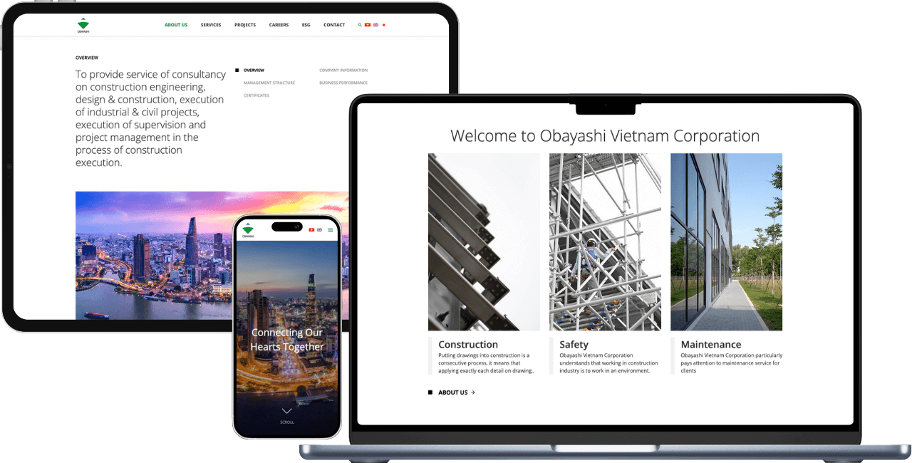
- Metro-style design is applied for the whole website, featuring eye-catching geometric shapes.
- The website provides informative content for visitors.
- Neat presentation of a host of projects with an attractive layout.
- A lot of whitespaces to make the website pleasant to browse
- Strong branding is reflected in the website.


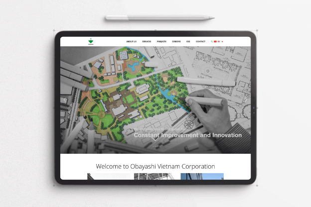
Obayashi’s website shines with the metro-style design
When it comes to Obayashi’s website, the first impression is that it possesses a metro style, highlighted by geometric shapes, a common characteristic of many Japanese websites. Based on its logo, the website’s color theme of green and white is used throughout the layout. The website also offers multi-lingual options on the menu, aiming to reduce the bounce rate. On the footer is the display of certificates, providing a transparent view of the brand’s capabilities. Lastly, other Obayashi-relayed websites are put in the footer section for easy navigation when users seek related websites.
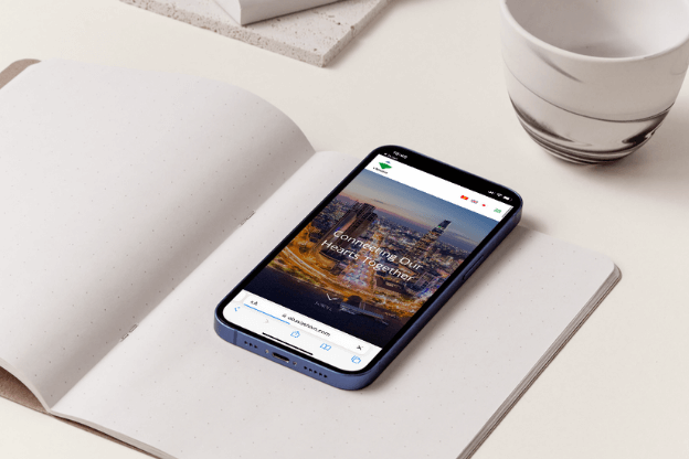
It was such an immense pleasure for CanhCam to craft an exceptional website for Obayashi Vietnam. With a professional working style when collaborating with Obayashi Vietnam, we endeavored to meet our client’s requirements, creating a website that exceeded their expectations. In the end, its website enhances the brand image, driving more traffic and increasing user engagement. Our client was delighted when receiving the finished product delivered by CanhCam.
